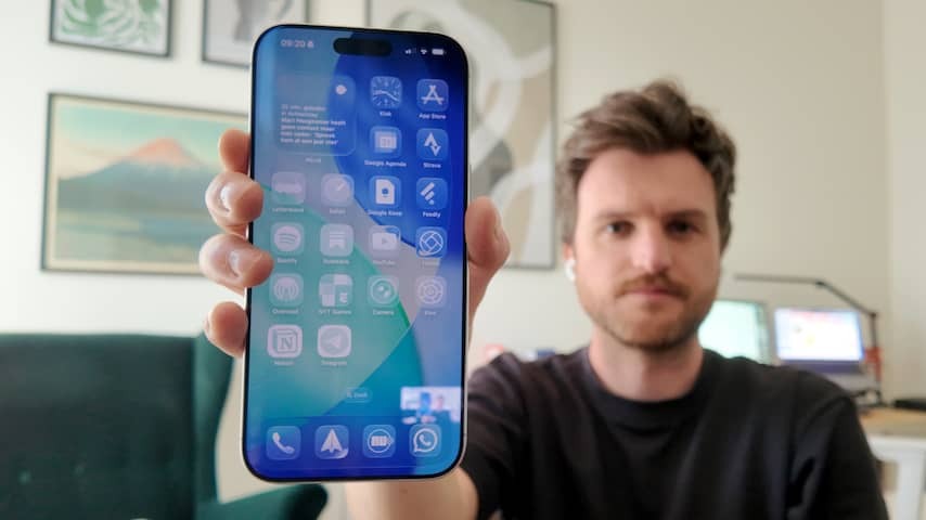
My iPhone looks very different this week than in recent years. I have installed a test version of iOS 26, the new operating system for iPhones that everyone can use in the coming fall.
Apple announced iOS 26 this week as the biggest innovation since the arrival of iOS 7 in 2013. Not only Apple skips a number of versions (from iOS 18 to 26, to equalize the version number with the coming year), the company has also devised a new design language: Liquid Glass.
Apple is largely abandoned the flat, brightly colored buttons and icons in recent years. With the new design it must look like apps and buds consist of glass plates that are over the screen. What does that yield? More depth and transparency. This is what it looks like:
0:40
View some images of iOS 26 here
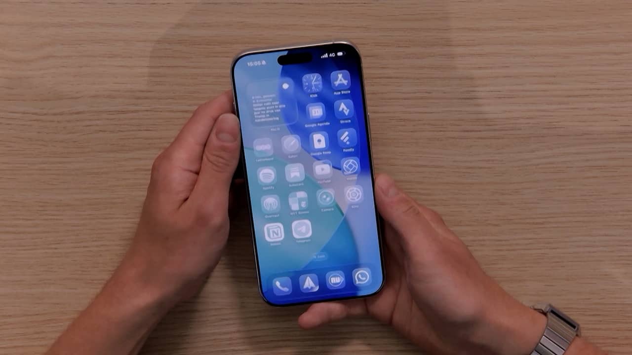
That is best to see if you set your iPhone on the new position ‘Helder’, as I did. App icons therefore become semi -transparent, so that they only let the colors of the background through. Since I set this, everything looks alike and I have always lost my apps. That immediately has benefits. Those few seconds that I am hannen in search of an app, last exactly long enough to make me realize that I don’t feel like opening the relevant app.
Opinions about Liquid Glass are online. I sometimes find the design very beautiful, for example when you wipe through menus and the buttons you select look like a digital water drop. In general, the design feels fresh but familiar.
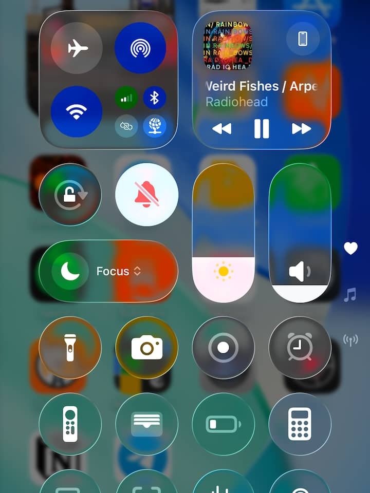
The criticisms are mainly about the readability of the system. I notice it when I receive notifications: White letters on a light background are hardly readable. And the iphone control panel becomes huge chaos on a colored background. I mean:
To Monique Verboeket of the eye association I ask if she anticipates problems for people with a visual impairment. But actually she is very positive. “If you have a visual impairment, you must always be able to turn off contrast -reducing institutions,” she says. “Taking up less transparent mode as standard is not necessary, there must be clear instructions on how it can be turned off. In general, Apple is doing very well.”
I have tested telephones for years and to be honest, that was more and more boring, simply because they have become more and more alike. Bad telephones are hardly made, but they no longer surprise. That is why such an innovation as this is so nice: it is something else and we all have to get used to it. Apple too. Hopefully the Liquid Glass company has completely dragged up for the official publication date, so that I can at least read my messages again.
I am a fan of the transparent apps for the time being, it makes it less fun to use my phone. And it helps me to get sentences in time before I end up in a doom scroll session.
My iPhone looks very different this week than it has in recent years. I have installed a test version of iOS 26, the new Operating System for iPhones that everyone will be able to use next fall.
Apple Announced iOS 26 This Week As The Biggest Innovation Since the Arrival of iOS 7 in 2013. Not only is Apple Skipping a Number of Versions (From iOS 18 to 26, to Match the Version Number With the Coming Year), But The Company Has.
Apple is Largely Abandoning The Flat, Brightly Colored Buttons and Icons of Recent Years. The New Design Should Make It Look As If apps and Buttons Consist of Glass Plates Lying on the Screen. What does that yield? More Depth and Transparency. That’s what it looks like:
 0:40
0:40
View some images of iOS 26 Lord
This is best seen if you set your iPhone to the new ‘clear’ fashion, as I have done done. App Icons Thereby Become semi-transparent, so that they only Let Through the Colors of the Background. Since I set this, Everything Looks the Same and I Keep Losing My Apps. That has immediate advantages. The Few Seconds That I Fumble Around Looking For An App Last Exactly Long Enough To Make Me Realize That I Don’t Feel Like Opening The App In Question At All.
Online, Opinions are divided about Liquid Glass. I Sometimes Find the Design Very Beautiful, For Example When You Swipe Through Menus And The Buttons You Select Look Like A Digital Water Droplet. Overall, The Design Feels Fresh But Familiar.
The Criticisms Mainly Conern The Readability of the System. I Notice It When I Receive Notifications: White Letters On A Light Background Are Barely Legible. And the iPhone Control Panel Becomes a Huge Chaos on a colored background. I Mean:
I Ask Monique Verboeket from the Eye Association (Eye Association) Whether She Foreses Problems For People with a Visual Impairment. But Actual She is very positive. “If you have a visual impairment, you should always be able to turn off contrast-degrading settings,” She says. “Enabling a less transparent fashion by default is not necessary, but there must be clear instructions on how to turn it off. In general, Apple does that very well.”
I have tested phones for years and frankly it was getting more and more boring, simply because they have Become more and more alike. Bad Phones Are Hardly Made Anymore, But they Haven’t Really Surprized Me In A Long Time Either. That is why such an innovation as this is so nice: it is something different again and we all have to get used to it. Apple too. Hopefully the Company Has Complety Refined Liquid Glass Before the official release date, so that I can at least read my messages again.
For the time being, I am a fan of the transparent apps, it makes it less fun to use my phone. And it Helps Me To Come To My Senses In Time Before I End Up in a Session of Doomscrolling.